URLs Can Be Beautiful
13 Mar 2008
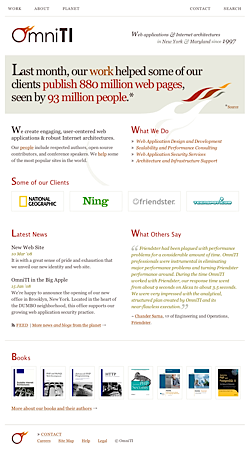
We launched a new web site for OmniTI on Monday, complete with a new identity designed by Jon Tan. As with most projects of this nature, this was all done in our spare time, but we're proud of the results and hope it represents who we are and what we do with a bit of our personality showing through.
If you spend some time on our site, its true beauty might begin to show; every detail has been designed with great care.
A few colleagues and friends have recognized the unique information architecture, particularly the URLs, which makes me very happy. I've mentioned URL vanity in the past, but the URLs we use on the new web site involve a level of rigor that goes beyond what I've done before. Instead of thinking purely in hierarchies, I wanted to also make the URLs powerful statements that stand on their own. The result is that we have URLs like this:
Each major category in the hierarchy is a verb (present tense), and although this is admittedly a little over the top for the most web sites, it can help you refine your information architecture to be more exact. For example, any page that can't be made to elegantly complete a sentence beginning with "OmniTI is" probably belongs somewhere other than the about section of the web site.
This might also be an aid if we begin to do more advertising, because our URLs have a voice of their own:
omniti.com/helps/national-geographic
Our URLs are just a subtle touch, and they're not explicitly called out in any way. For example, links to /is, /does, and /thinks are labeled about, work, and planet, respectively. If other sites can get away with ugly URLs, surely we can get away with having some fun.
As is the case with fashion shows, the point of something like this isn't to suggest that it's a practical style for everyday use. Rather, we hope to make room for more creativity and highlight the beauty of paying attention to details.
Thanks to everyone who noticed. :-)

